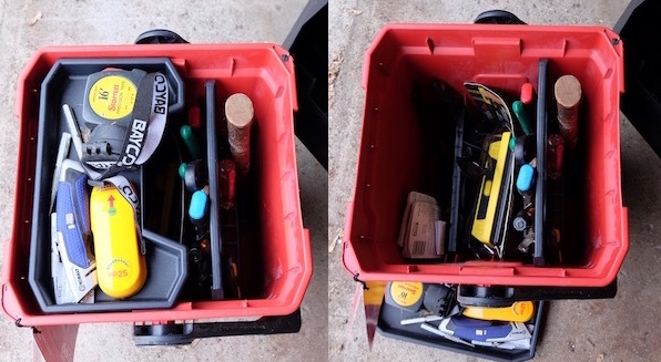
Mike Velasco joins Tim Keirnan for a critique of the Milwaukee 13″ Jobsite Work Box. This tool box is oriented vertically in contrast with conventional tool box designs, which provides both advantages and disadvantages. While Mike enjoys the design and uses his tool box regularly, Tim has not been as impressed despite the numerous positives of the product’s design and construction. This is why we do the show! Good designs cannot always please every user; people are too different from each other in their needs, contexts, and in this case, eyesight.
As usual, we structure our critique around the following points:
* Encounter
* Decision
* Purchase
* Initial Impression (out of the box)
* Longitudinal review
You can find the tool box at Milwaukee’s site here:
https://www.milwaukeetool.com/Products/Storage-Solutions/48-22-8010
Note that product photography usually involves very bright lighting, and in this case Tim was not expecting the interior to be as dark as the product photos appeared. The photo on the Design Critique blog page is not using a flash for a more accurate representation of what a user sees when looking into the box for tools along the bottom.
Listen Now