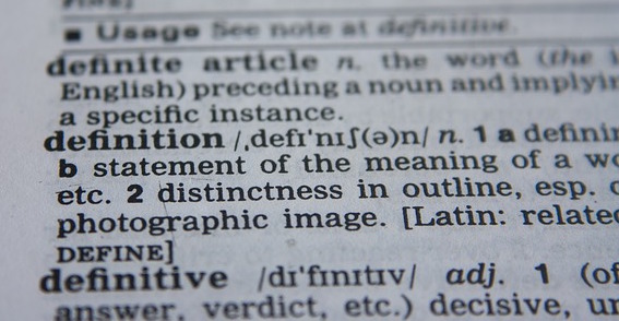
Dave Mitropoulos-Rundus returns to talk with Tim Keirnan about labels for our field. This continues our long-running friendly discussion about what should we be called and why, and is there a difference–or should there be–between User Experience and Customer Experience? Dave appreciates the terminology differences whereas Tim wonders why we make such fine distinctions when at the root level we’re all “Designers of Stuff” (trademark pending).
We advise that you read Kelly Goto’s excellent 2018 article X Marks the Spot in Experience Design Thinking: UX vs CX vs Service Design.
And also Jared Spool’s excellent article, UX and CX: Same Language; Different Dialects, conveniently published the day we recorded this episode. We think Jared’s a mind reader!
NOTE: Tim regrets interrupting Dave in this recording, bad etiquette! This is what happens when your producer is hopped up on cough syrup, which you can hear in his deep head cold voice breaking worse than Peter’s in that famous Brady Bunch episode.
Read Article
Listen Now

Keith Instone and Serena Rosenhan both return to the show for an episode about what Tim Keirnan is calling the “buzzwordification” of UX. The last few years have seen a big rise in the use of UX terminology in the media and in our workplaces. What are the advantages and disadvantages for UX practitioners now that UX has become a popular term beyond colleges and professional societies? Tim moderates the round table discussion with Serena and Keith, and the wisdom pours out of those two veteran UX professionals.
The fireplace crackling gets a bit loud at points, but plying guests with food, drink, and fireplace ambience is part of our recording process. Rest assured the fire stayed in its place.
Note: Neither Serena nor Keith are speaking on behalf of their employers, past or present. Neither is Tim.
With a little luck, there will be more conversations on this topic in 2019 with other Design Critique alumni.
Bumblebee image by Josef Pichler on Pixabay
Read Article
Listen Now

Syed Ibrahim returns to the show to talk with Tim about his side project, Shoutouts.app.
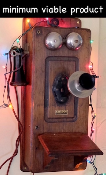
Syed’s story of creating this web application is a terrific example of doing a minimum viable product (MVP). He candidly shares both advantages and disadvantages of releasing an MVP, and walks us through the details of having an idea, acting on it to create something that works at a basic level for a specific audience, and getting it out there to continue learning and enhancing it.
You can find Syed at
https://www.syedibrahim.me
One of the best definitions of MVP is from Frank Robinson, who created the term around 2000:
http://www.syncdev.com/minimum-viable-product/
Lest anyone think the photos of the antique telephone are a snarky comment on the idea of an MVP, forget it. Syed liked the phone (which does still receive calls on a POTS land line) and requested it be used as the image for this episode. Like Syed’s new web app, hand crank telephones attempted to do only one thing very well for their users, and in many cases succeeded. Additional features were added over the decades, of course…but that’s a story for another episode.
Read Article
Listen Now

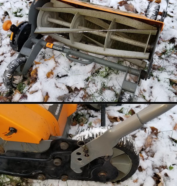
Ben Woods joins Tim Keirnan for a single point perspective on the Fiskars StaySharp Max reel mower. Needing neither gasoline nor electricity, this lawnmower is completely powered by the user to cut the lawn.
Ben discusses the values that led to his wanting this mower and his experience with it over several summer months of use. As usual we follow the critique structure to learn his experience with
- Encounter
- Decision
- Purchase
- Out of the Box
- Longitudinal Use
Ben can be found at www.dbenwoods.com.
Read Article
Listen Now

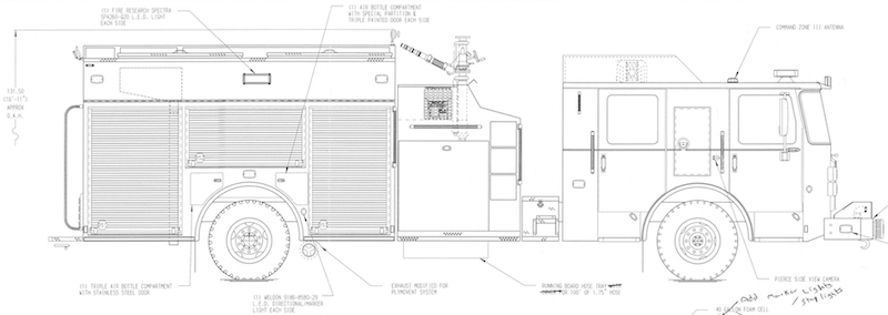
Fire Department Chief Dan Phillips joins Tim Keirnan for a discussion about designing a new fire engine for Plymouth Township, Michigan. How does our fire department decide which features are most needed, most wanted, and affordable for a given budget and for the engine’s coverage area?
Unlike most passenger cars, a new fire engine is custom built and takes ten months to deliver. Their cost is over half a million US$. The pressure is on a department to get it right, because the service life of a fire engine is 15 years active duty and 5 additional years in reserve. The new engine must balance multiple goals:
* Provide safety for the township citizens and their property
* Provide safety of the firefighters who use the truck every day
* Provide good financial stewardship of our public funds
You can see our Public Safety Committee’s short documentary videos on the obsolete current fire engines at
https://www.youtube.com/channel/UClTidKC6ZDUJVLoWedD5_gA
Our first new fire engine is a Pierce Enforcer. Check out Pierce’s website for the Enforcer and other fire engine details:
https://www.piercemfg.com/
Thank-you to the men and women working in fire departments everywhere.
Read Article
Listen Now
Thank-you to Ben Woods and the good people of UX Akron for inviting me to speak this month. I look forward to an evening with those who can make it out.
https://www.meetup.com/uxakron/
Read Article

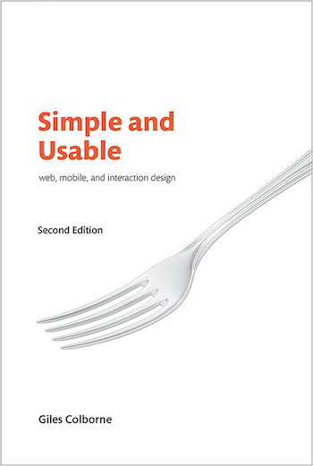
Author Giles Colborne returns to Design Critique to talk with Tim Keirnan about the new second edition of Simple and Usable: Web, Mobile, and Interaction Design.
Simple and Usable is one of the best books on UX we’ve owned in our careers. The contents are simple and usable just as the title promises, and this is one book that both practitioners and stakeholders will benefit from reading.
Giles and Tim talk for 40 minutes about various topics including
- Giles’ career having progressed along with the UX profession across the decades, moving from basic website design to service design to organizational design.
- The physical design of the book reflects the content, and the publisher did not stray from the successful book design of the first edition.
- How “get out of the office” is still of prime importance today and the crucial importance of field research with our users.
- The seductive danger of relying on expert users in our designs.
- How Alan Cooper’s method of Personas has been undermined by some practitioners’ use of person-less personas when they haven’t even talked with or observed actual users. How this risks the integrity of the design profession as much as a user-less usability test would.
- Working with stakeholders on design projects, being teacher or facilitator as opposed to “persuader”.
- Don’t rush into design. Understanding what’s core takes time.
Simple and Usable can be found at its entry on publisher Pearson/NewRiders’ site.
Read Article
Listen Now

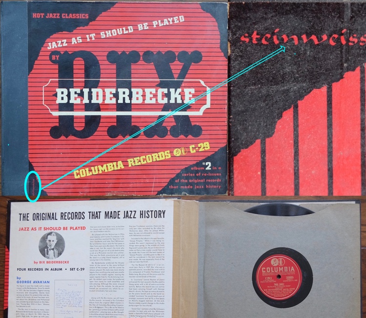
My grandparents were spectacular people who gave me the best things in life: encouragement, loving memories, and cool artifacts from history. Their collection of old 78 shellac records not only sounds great, it looks great, too. Now I know why. Rudolf A. Bruil wrote a wonderfully thorough article on the visual design and packaging of the old 78 shellac record and 33 1/3 RPM record formats. If you appreciate those old records for not only their vintage sound, but also their visual design and packaging, read his article titled “Alex Steinweiss and Other Artists and Designers” at SoundFountain.org.
http://www.soundfountain.org/rem/remcovart.html
I didn’t know about the pioneering visual design work of Alexander Steinweiss and others for record labels like Columbia. It turns out he designed some of my favorite 78 record sets from my grandparents. In the photo for this post, I enlarged his last name on the front cover so you can see it. If you like Bruil’s article on packaging design, make sure to listen to our 2007 episode with Dr. Bix and the MSU School of Packaging.
Thank-you Mr. Bruil for your excellent in-depth article. And thank-you, Gram and Grampa, for sharing your lives and your record collection with me. All these years later I still miss you every day, and am still learning from the legacy you left.
Read Article

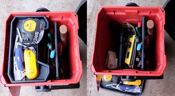
Mike Velasco joins Tim Keirnan for a critique of the Milwaukee 13″ Jobsite Work Box. This tool box is oriented vertically in contrast with conventional tool box designs, which provides both advantages and disadvantages. While Mike enjoys the design and uses his tool box regularly, Tim has not been as impressed despite the numerous positives of the product’s design and construction. This is why we do the show! Good designs cannot always please every user; people are too different from each other in their needs, contexts, and in this case, eyesight.
As usual, we structure our critique around the following points:
* Encounter
* Decision
* Purchase
* Initial Impression (out of the box)
* Longitudinal review
You can find the tool box at Milwaukee’s site here:
https://www.milwaukeetool.com/Products/Storage-Solutions/48-22-8010
Note that product photography usually involves very bright lighting, and in this case Tim was not expecting the interior to be as dark as the product photos appeared. The photo on the Design Critique blog page is not using a flash for a more accurate representation of what a user sees when looking into the box for tools along the bottom.
Read Article
Listen Now

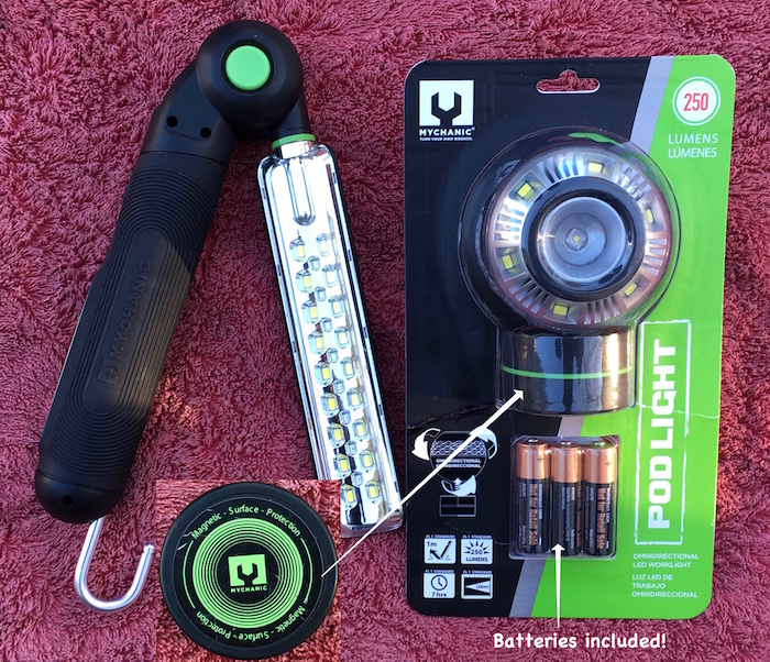
Industrial designer Gene Duarte joins Tim Keirnan for a discussion about the Pod Light and the Blade Multi Light, two of Gene’s designs for Mychanic. As Head of Product Development, Gene tells the story behind the designs of these two creative and usable reinterpretations of the shop light. Tim has used them successfully for ten months and explains why they serve his needs in the garage and the house so well. Well done, Mychanic
.
You can find Gene’s Pod Light and Blade MultiLight at
https://urbantransit.com/collections/garage
In the photo above, the magnetic base of the Pod Light is shown with the paint-safe Surface Protection sticker showing. Also, note the packaging of the Pod Light with the included batteries clearly obvious.
Read Article
Listen Now
